Case Study

Wave Bank
Responsive Banking Application
For my Professional Certificate in UI Design assignment, I designed a new, responsive banking application user interface for a fictional challenger brand named Wave Bank. The project involved developing a fresh brand identity, colour palette, typographical scale, icon and illustration set, as well as wireframing and designing a set of three core screens in desktop, tablet and mobile layouts.
For this project, I received an outstanding mark of 96% as I demonstrated my branding expertise and clear understanding of navigation and layout, colour, shape, iconography, and typography in UI design. The end result was a cohesive set of screens which felt fresh, modern, and intuitive for users, but more importantly succeeded in representing the three core brand principles of ‘Playful’, ‘Clear’ and ‘Trustworthy’.
Scope
Branding, Visual design, User interaction design, UX design
Year
2023
Softwares / Languages


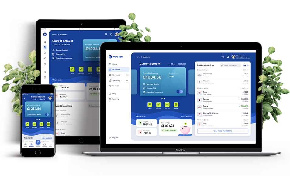
Final Screens
For each screen, I mocked up 4 responsive layouts: mobile (1 x small
– 320px wide, 1 x large – 393px wide), tablet (768px wide) and desktop
(1440px wide): 12 screens in total. When wireframing and mocking up the
mobile designs, I thought it would be beneficial to show two varying
screen sizes to demonstrate how the design would responsively adapt
and scale to fit a smaller vs a larger mobile device
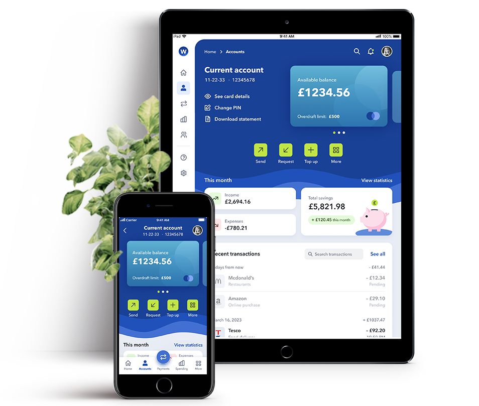
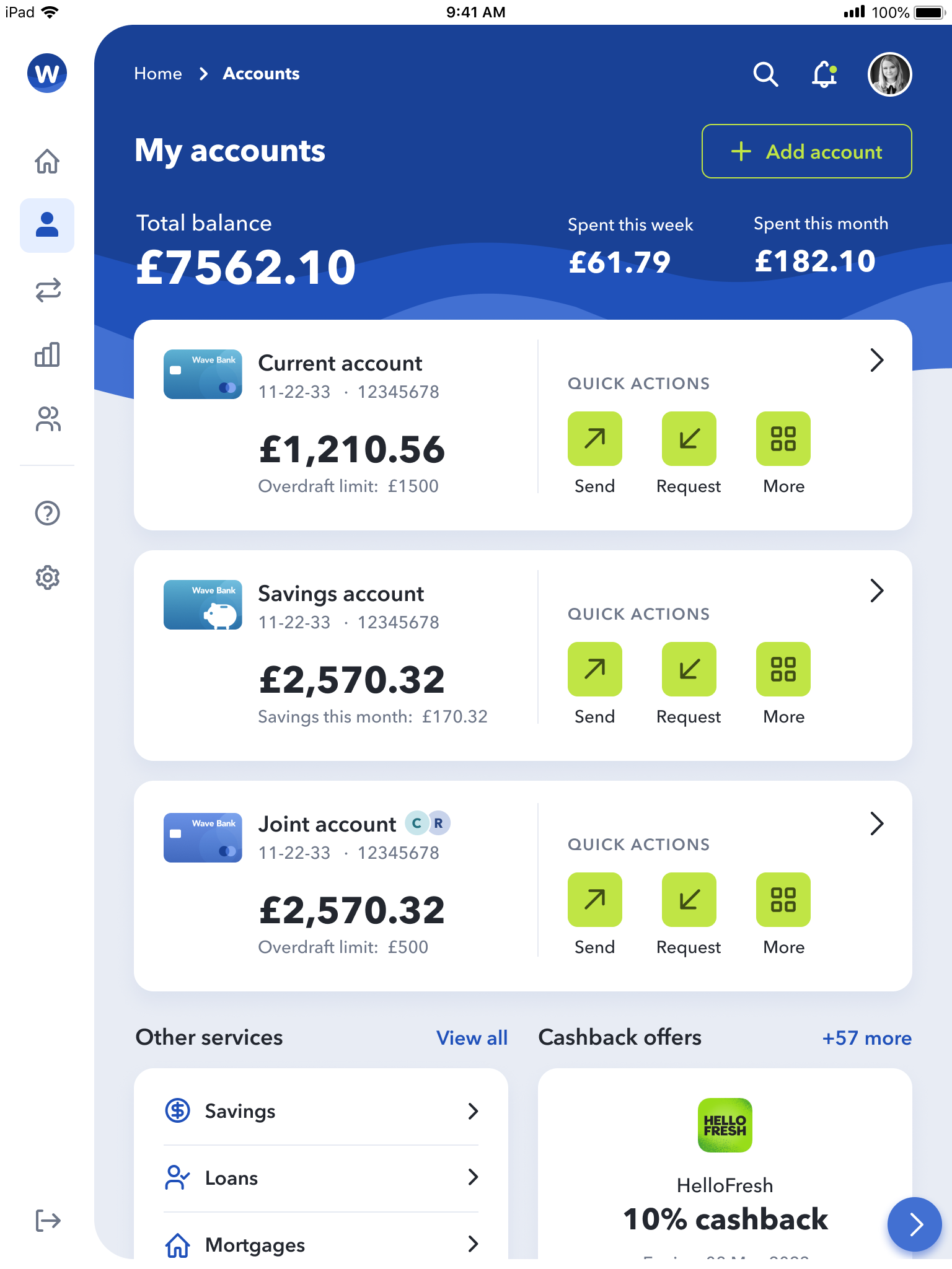
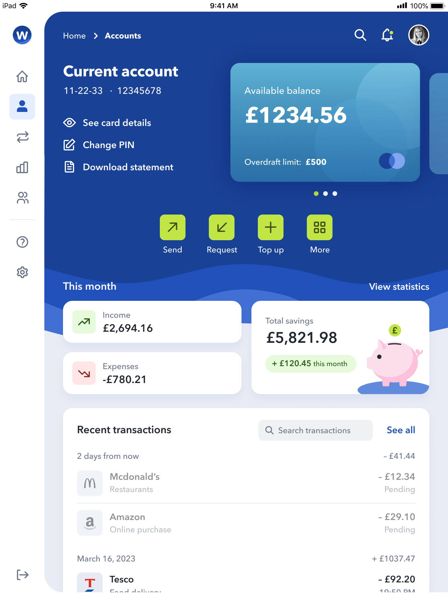
1. My Accounts
(where the user can see their different banking accounts)
.png)
.png)
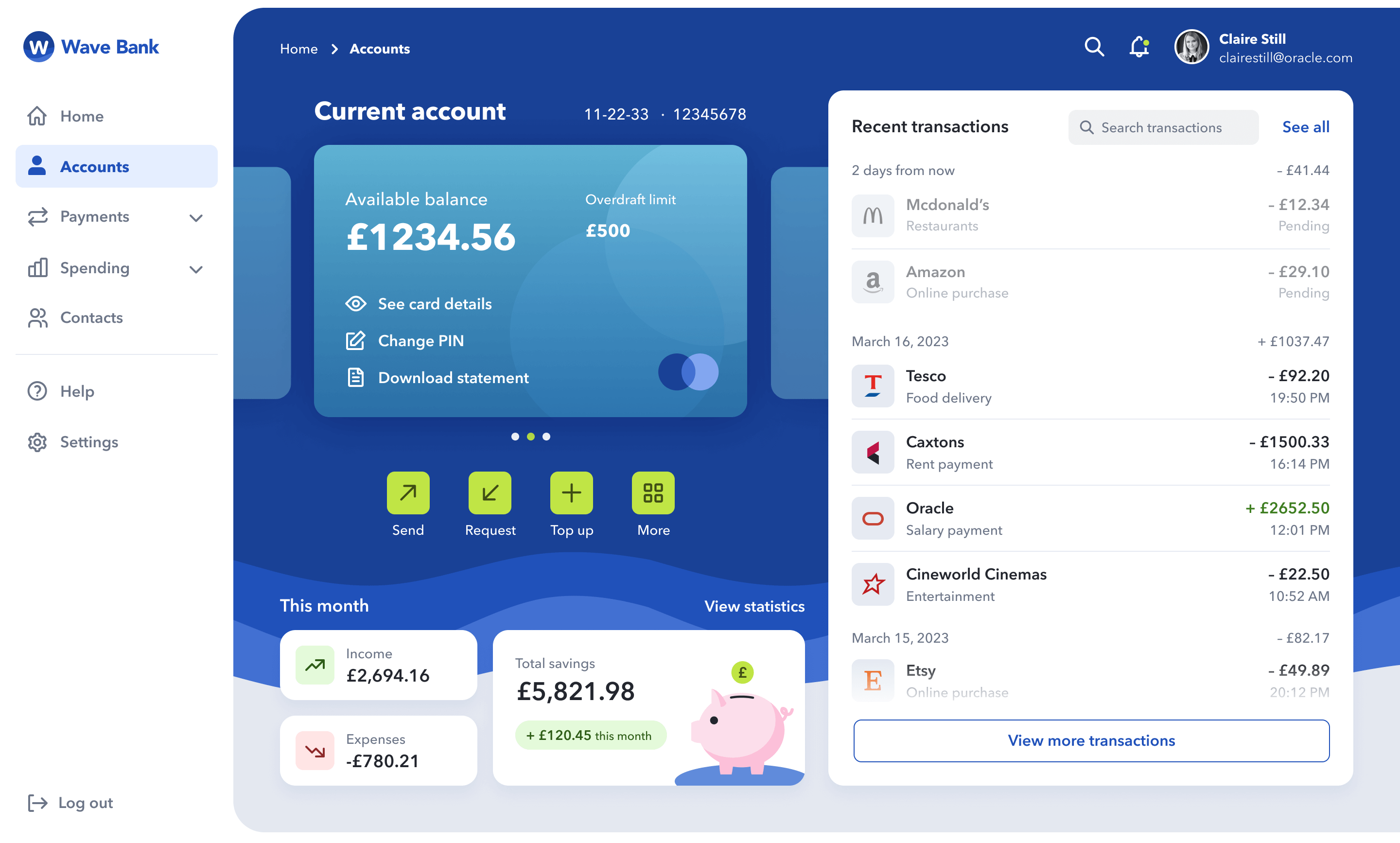
2. Current Account
(which shows a more detailed view of the user’s
current account details and recent transactions)
.png)
.png)
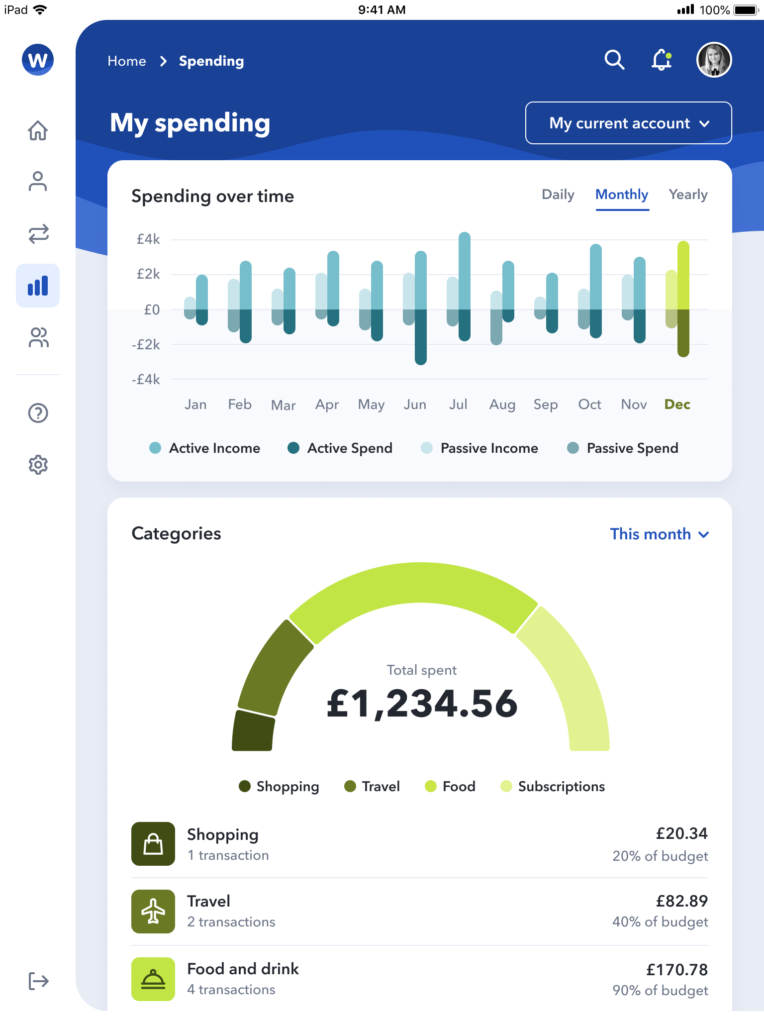
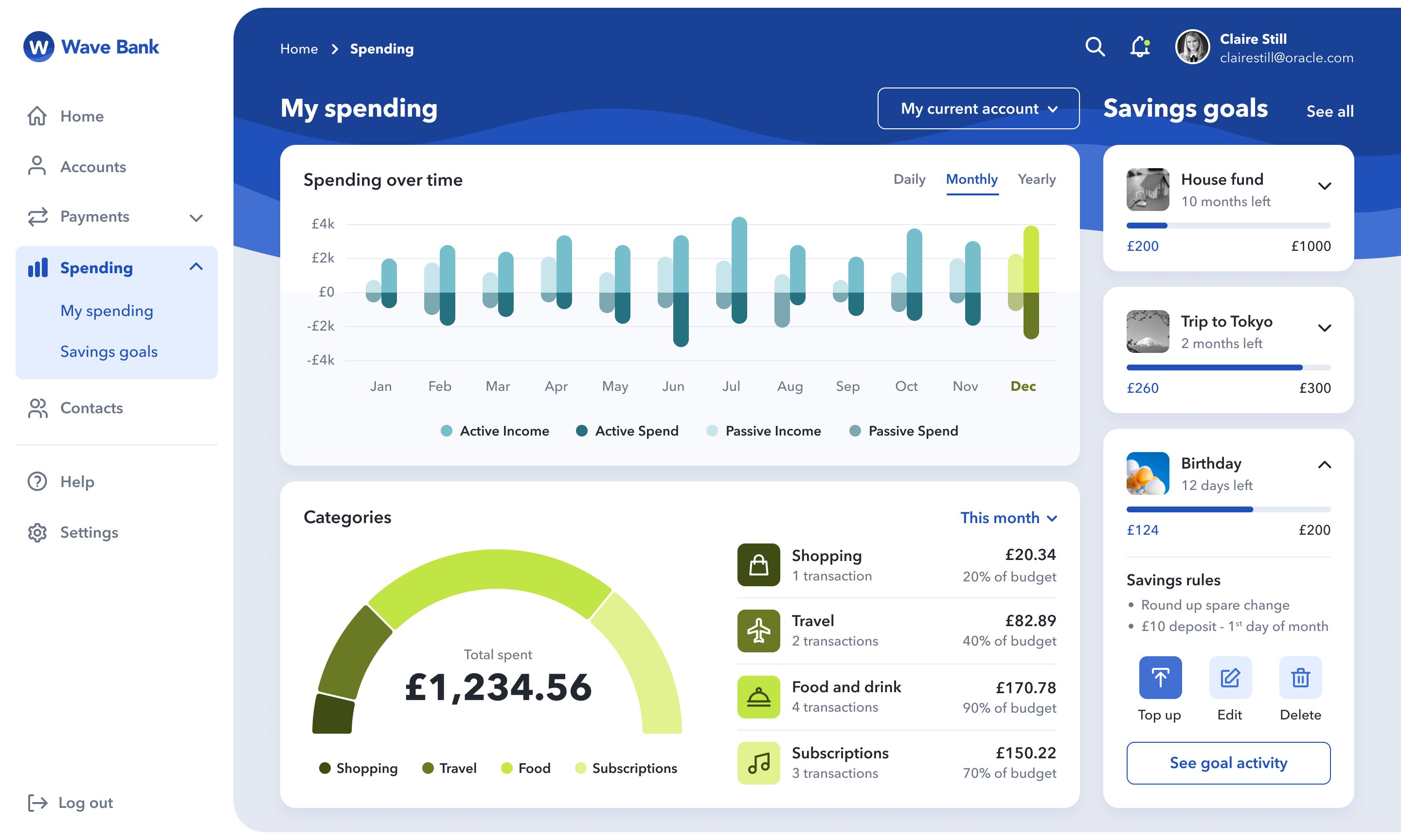
3. My Spending
(where the user can see an overview of their spending
over time, a breakdown of their expenses per category type, as well as
a list of their savings goals)
.png)
.png)
Wireframes, navigation and layout
Before looking at the aesthetics of my app’s UI design and branding, it was
first important to decide on the content that would sit on each of the screens;
the type of content that would both be expected and relevant for the
customer, and how this would be presented clearly and intuitively for mobile,
tablet and desktop users.
Firstly, to ensure content was positioned and aligned consistently across my
different UI screens, I set up responsive column guidelines on my Figma
artboards: 12 columns on desktop, 8 on tablet, and 4 on mobile. I also set an
8px grid across all screen artboards and ensured all gutters, margins, and
paddings were multiples of 8 (or 4) to give the screen layouts a sense of
order and balance.
I then used my knowledge of Gestalt principles (including
proximity, similarity, symmetry, continuation, and closure) to group and lay
out the content within my wireframes. For example, I implemented Gestalt’s
principle of proximity by opting for a card design approach, whereby white
rounded boxes visually contain content that is more closely related. I
also used negative space and subtle divider lines to visually separate
unrelated content and allow the user to digest the content on-screen more
quickly and easily.
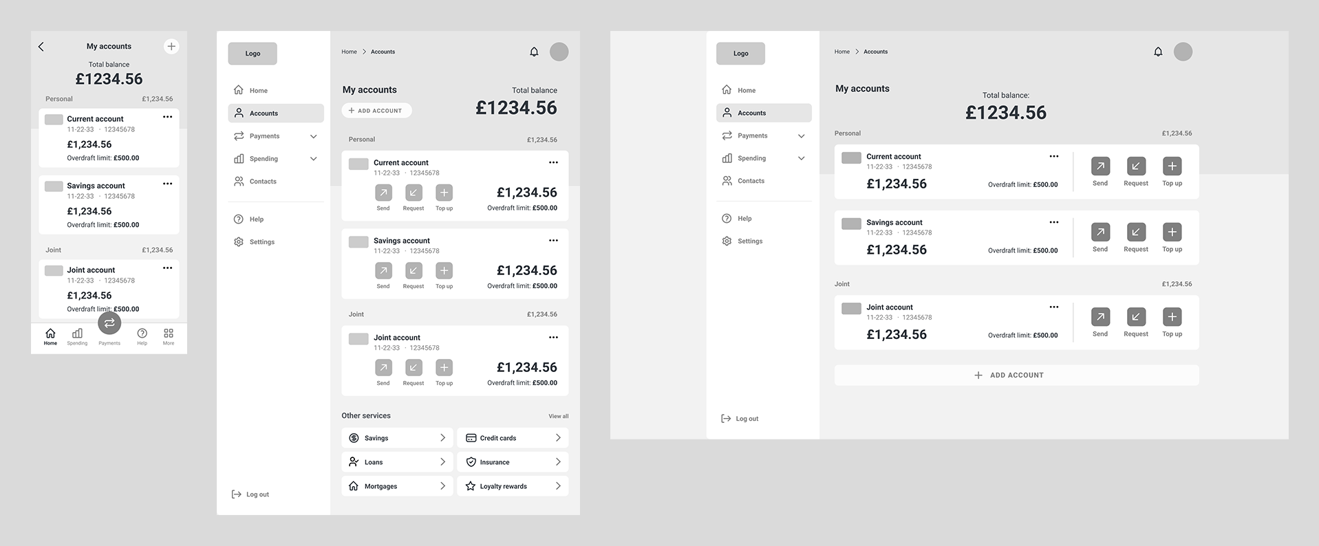
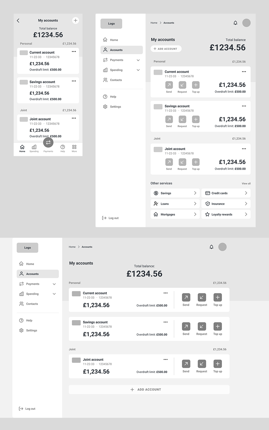
'My Accounts' screen wireframes
In terms of layout, I divided up the content creatively within the
columns as too much symmetry can sometimes be predictable and boring. I achieved this through using asymmetrical layouts and overlapping elements on the page to "break" the grid visually. When doing this, I ensured spacings and alignments remained consistent with the
rest of the UI so that the design decisions felt intentional.
When designing the
carousel component on the Current Account screen, I implemented Gestalt’s principles of ‘continuation’ and
‘closure’ by showing a small slice of the unselected cards and fading them
off-screen to suggest to the user that there is more that can be revealed by
swiping left or right.
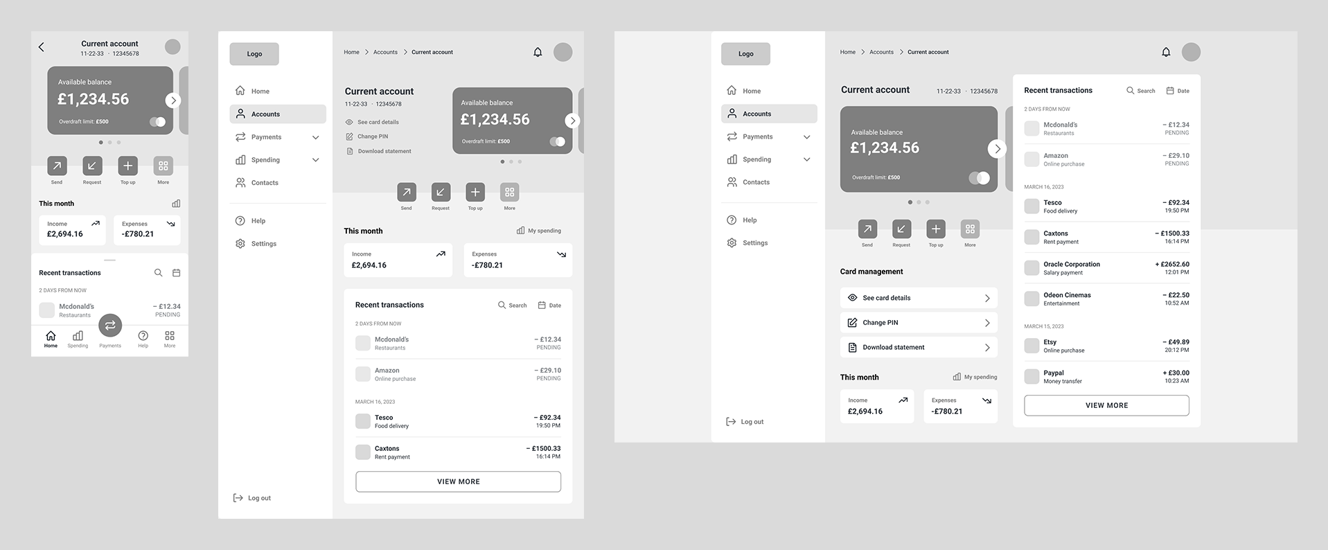
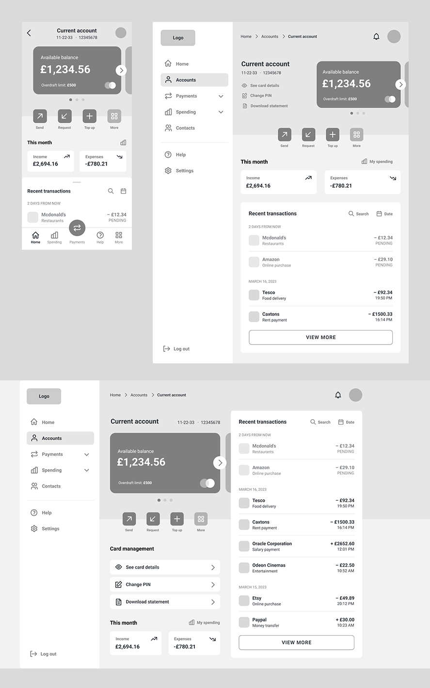
'Current Account' screen wireframes
Based on my research of F and Z page scanning patterns, I also ensured the hierarchy of content on my screens flowed from top left to bottom right, with the main headings and key information at the top left, and least important information bottom right. It was also important for accessibility purposes to left align the copy on-screen, as a consistent left margin makes reading easier for those with cognitive disabilities.
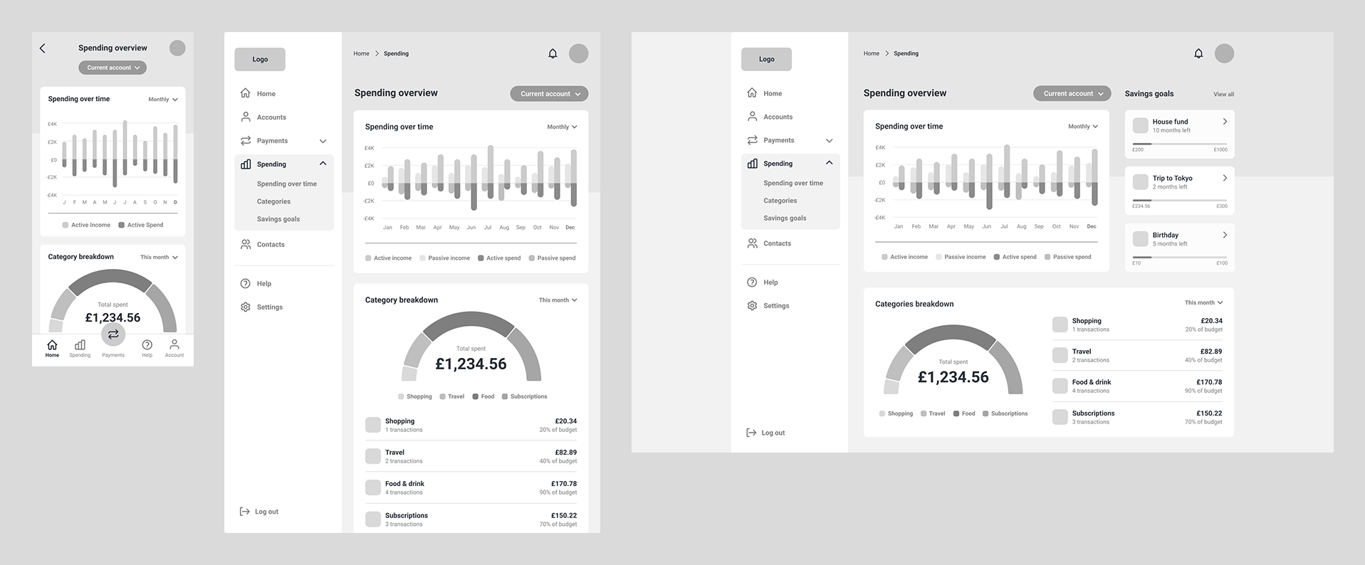
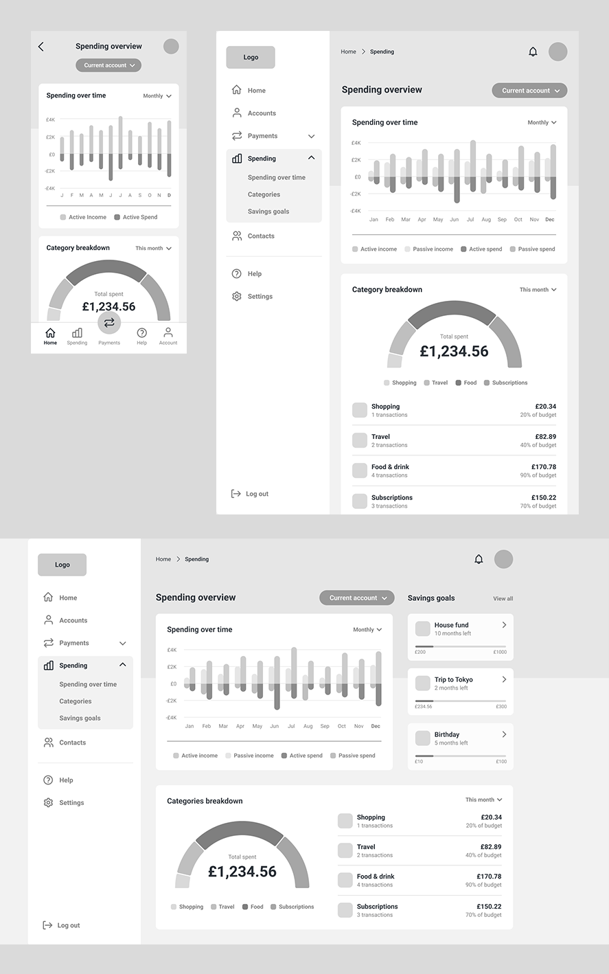
'My spending' screen wireframes
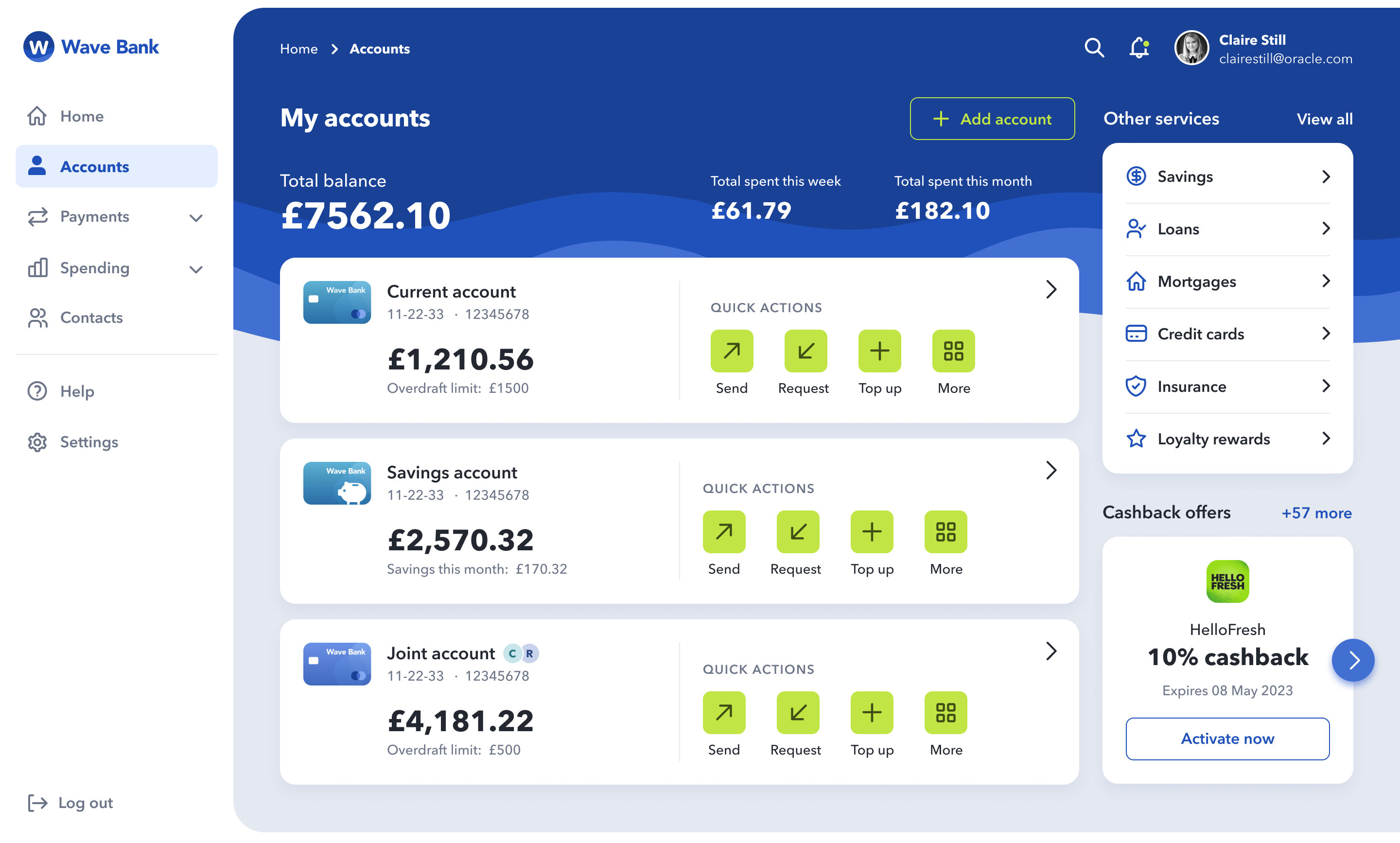
Navigation
When working on my wireframes, it was important to consider how the user
would navigate the banking app and how best to achieve this in the UI. Since
banking apps typically include a lot of different screens for different products
and services, I decided sidebar navigation would work best on desktop and
tablet screens. By having the menu fixed, this also ensures the app’s menu
items are not hidden away and are always accessible to the user.
For mobile, I decided based on my research of existing products that app
bar navigation at the bottom of the screen would be most appropriate since
it allows for easy thumb access and reachability. I ensured a maximum of five
navigational items were used so that each icon and description had enough
surrounding space, even on smaller devices (like iPhone SE at 320px wide).
To give the primary ‘payment’ call-to-action more affordance on-screen, I
centered and floated it so that it visually sat apart from the rest of the items in
the app bar.
In addition to the sidebar menu on tablet and desktop, I included a
consistent header area across my screens, containing navigational
breadcrumbs (allowing the user to see where they’ve been and where they
are now), as well as a search bar (allowing the user to search the app for
keywords), notification icon (to alert the user of any important news or
updates) and profile picture with account name (for a personalised touch and
to signify that they are logged in). These extra navigational UI components
5
provide additional functionalities that are recognisable for most users and so
reinforce a sense of familiarity and trust within the app.
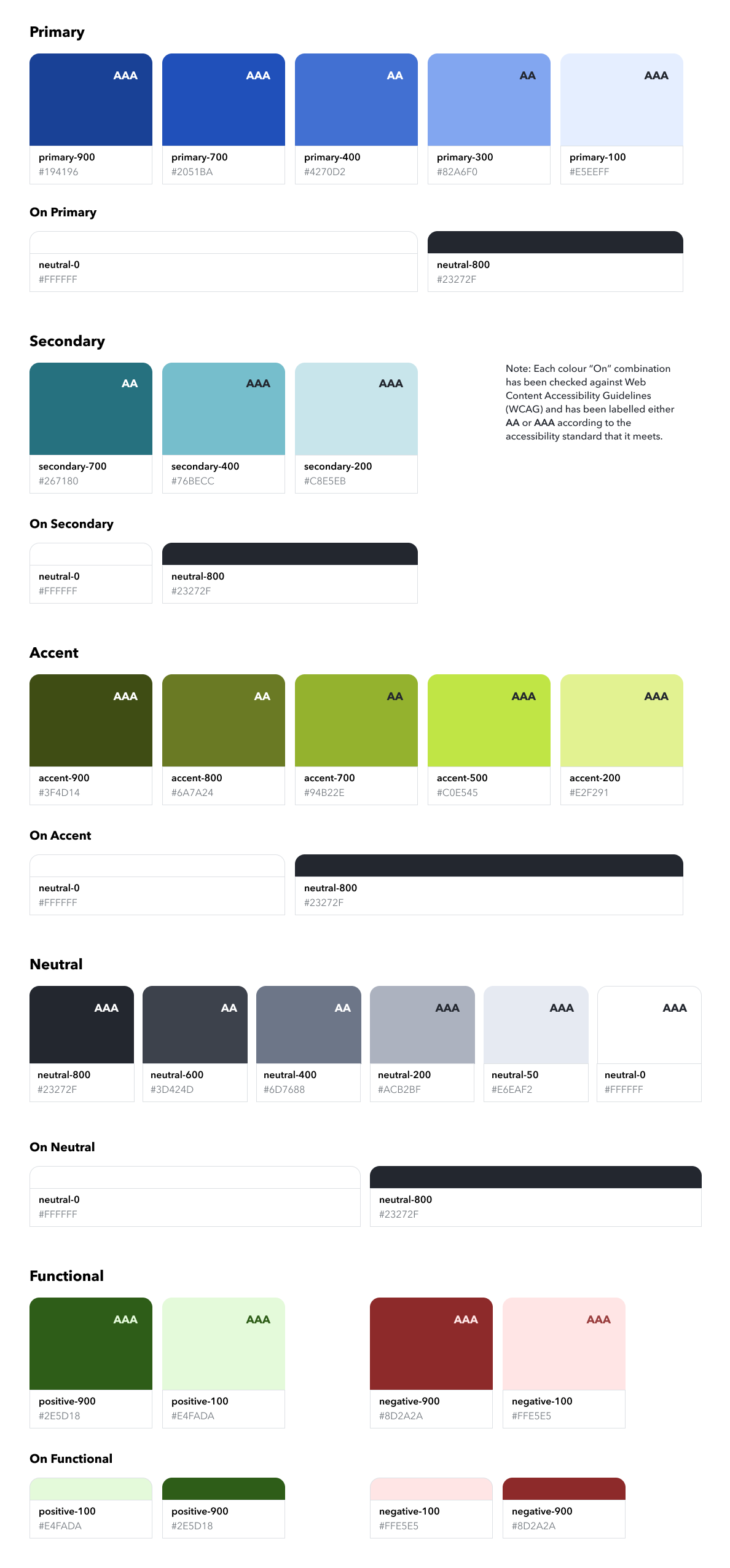
Brand colour palette
When deciding on a colour palette for my brand, I used my research of
competitor financial brands and colour connotations to select hues that
would communicate trustworthiness, confidence, and security. This is why I
decided upon a deep blue as my primary colour and a complimentary light
blue as my secondary colour. Cool tones appear calming and professional
and meet the brand principle of ‘trustworthy’ for this project.
Another popular colour in the world of finance is green as it connotes money
and wealth, so I opted for a lime green shade as my UI’s accent colour. I
chose a green that was vibrant and zesty in tone so that it contrasts well with
the primary blues and injects a feeling of freshness and playfulness into the
brand design (meeting the assignment’s brand principle of ‘playful’).
For my neutral palette, I used HSB colour controls in Figma to desaturate my
brand’s primary blue colour but fix the hue, so that I could achieve a range of
grey tones that felt harmonious with the primary blue colour on-screen.
As for functional colours in my UI, green connotes positivity while red
connotes negativity, so I used these shades in areas of my UI where I wanted
to communicate these themes - for example in the icons for Income (green =
positive) and Expenses (red = negative) on the ‘Current Account’ screen.
Accessibility considerations
Accessibility is very important in UI design, so when selecting exact hex values I checked the contrast ratios of each colour and background colour combination to ensure that they met the minimum AA accessibility standard according to Web Content Accessibility Guidelines (WCAG). In addition, when choosing colours for my graphs on the ‘My Spending’ screen, I used different shades of the same colour so that users with colour blindness can differentiate areas of the graphs more easily.
Typographic scale
For my banking application, I put together a typographic scale to establish hierarchy and ensure consistency of typeface styles across my banking application UI. The typographic scale defines typeface, weight, size, line height and letter spacing for a range of textual elements, including H1-H6 headings, body copies, labels, CTAs and text links.
In terms of accessibility, I have ensured fonts are large enough for users to
comfortably read the text on-screen and leading is not too tight (120-150% of
font size). For example, body copy, text links and CTA font sizes are set to the
recommended 16px, with a line height of 24px.
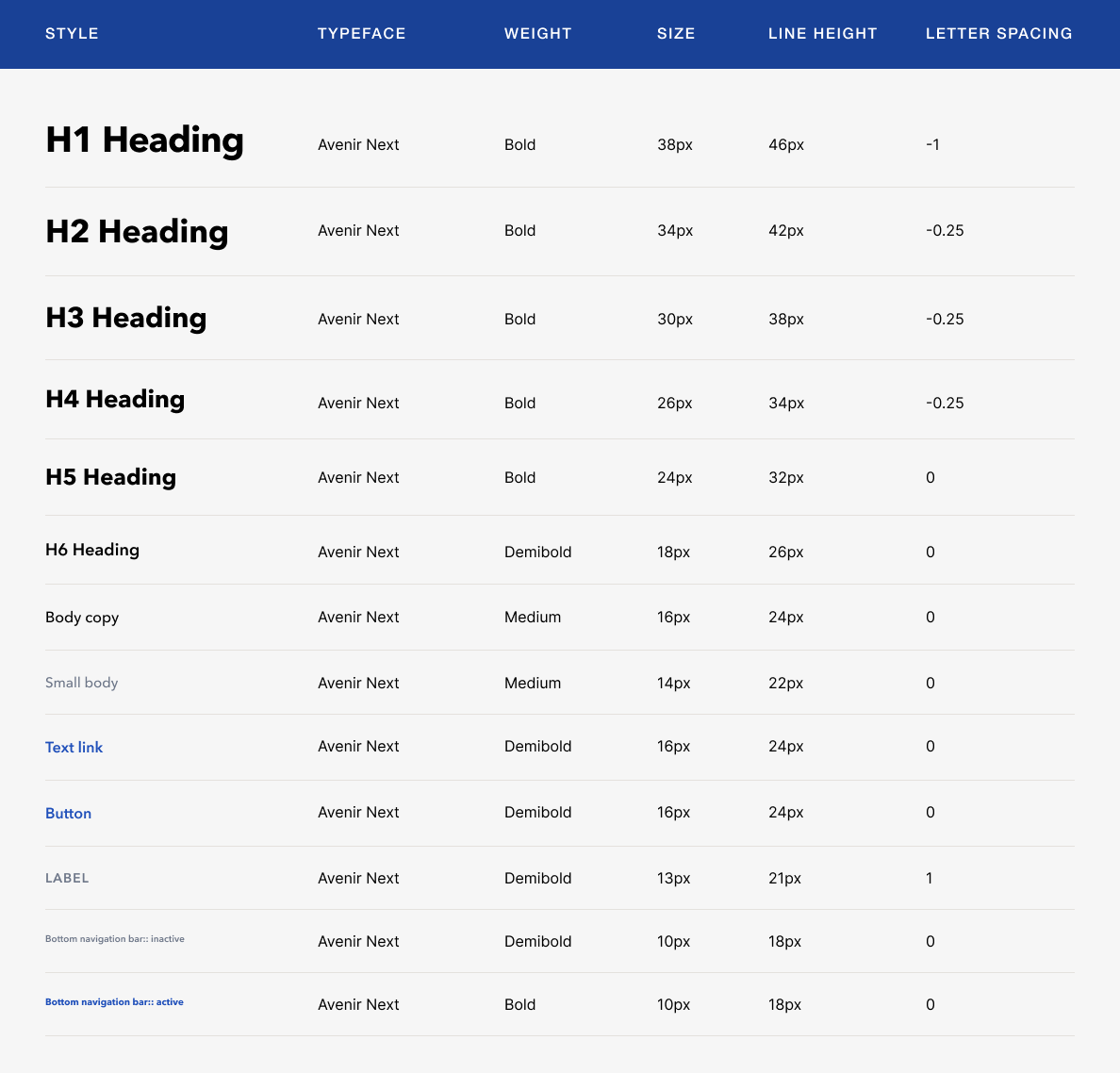
Font choice
From my research into different typefaces, I learned
that sans-serif fonts appear more friendly, modest, and legible than their serif
counterparts. Although serif fonts can appear more traditional and
sophisticated in their design (which could be appropriate for a financial
client), I felt it was more important to choose a sans-serif font that was
modern, clear, and readable, and would ultimately be better suited for a web
application which would be viewed across a range of device sizes.
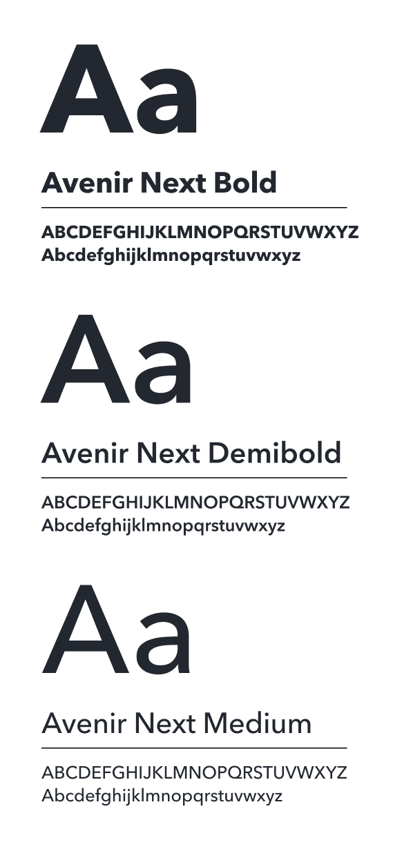
Early in the design process, I selected a font pairing of Inter for headings and
Avenir Next for body copy, based on the above criteria, however during my
design iterations I felt that the combination wasn’t working as there was not
enough differentiation between the two. Inter also contained a larger x height and narrow character widths, which felt disjointed when place besides
Avenir Next. Since Avenir Next was my favourite of the two fonts due to its
more rounded and playful characteristics, I decided that rather than using
two separate typefaces, I would use just the one and establish a
typographical hierarchy through contrasting font weights instead. For
example, in my screen designs, primary headings are set to Bold weight and
act as visual anchors on the page. Font weights then decrease based on level
of hierarchy, so sub-headings and call-to-actions are styled with Demi Bold
weight, and body copy is set to Medium.
I then used colour to give certain copies either more or less visual weighting
on screen based on their importance. For example, on the ‘My Accounts’
screen, rather than styling all the copy in the same color, I used grey to
visually set back the sort code/account no. and overdraft limit information,
since these copies was deemed less important than the account type and
balance value.
Shapes and iconography
When exploring shapes for my UI design, I considered the ‘playful’ and ‘trustworthy’ brand principles outlined in the brief. Compared to sharp, pointy edges which can appear rigid and aggressive, circles and curves are very organic in nature and are perceived by the eye as soft and inviting. I therefore chose to apply rounded corners to all containers within my UI; for example, 8px on CTA buttons, 16px on cards, and 32px on screen borders (for tablet and desktop views) - all multiples of 8 to align with the grid.
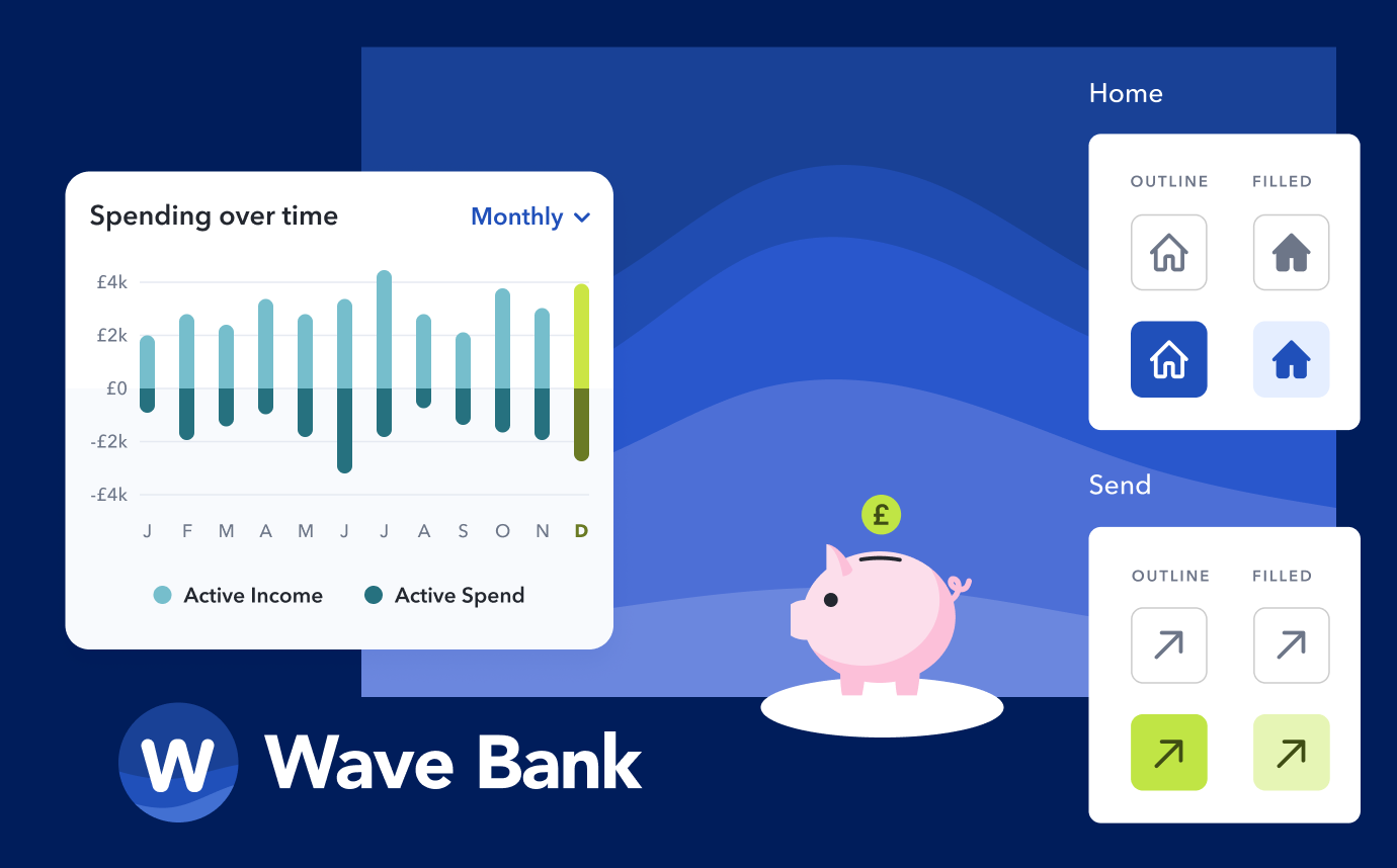
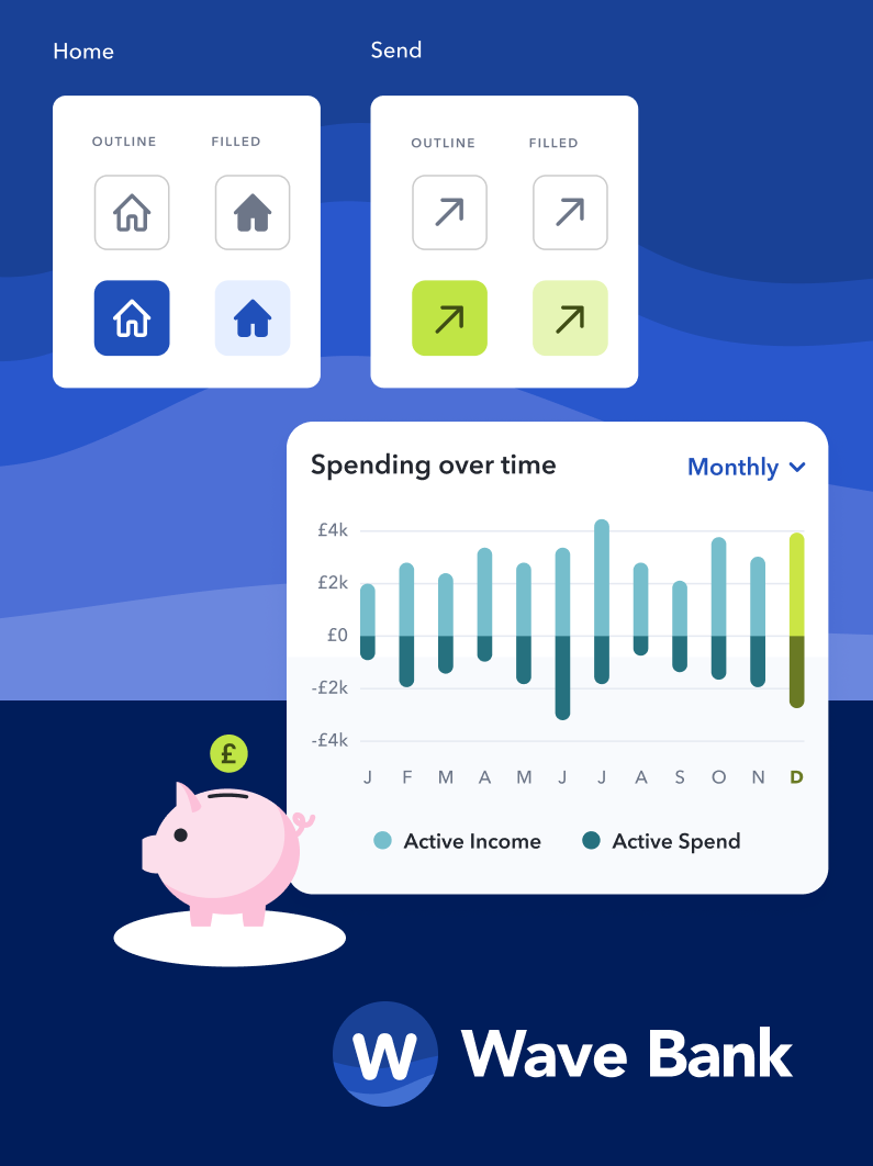

From my wireframes and understanding of Gestalt’s proximity principle, I knew I also wanted to include some sort of fluid background graphic to overlap and visually tie my screen content together. This felt like a good opportunity to hone my UI’s playful and curvy visual language and so I explored the idea of ‘waves’ as a theme for my brand collateral. I stumbled across a free, online SVG shape generator app called ‘Haikei’1 and generated some unique, curvy shapes using the ‘wave’ option. I played around with a few on-brand colour options, exported them as SVGs, and incorporated them into my Figma screen designs. I found these wave shapes worked well as a backdrop device, acting as a visual anchor at the top of the screens and allowing the lighter foreground content to pop on the darker blue background. I find the sweeping nature of the wave shapes also helps to successfully lead the user’s eye across the screen by creating a sense of movement.
As for iconography, I used my mood board inspiration and research of icon styles to choose an icon set for my app UI that appears legible (particularly at smaller scale), clear (not too detailed), and most importantly, communicates and represents the subject matter well. I believe my chosen icon set is successful in these three areas. The rounded outline style of the icons also feels on-brand and visually balanced with the rest of the UI. See below the icon set for my banking application.
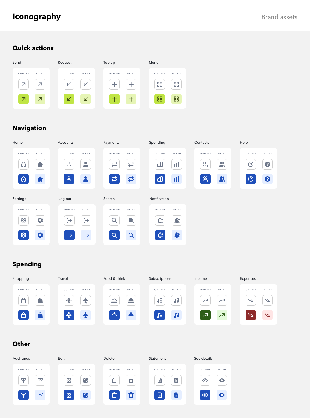
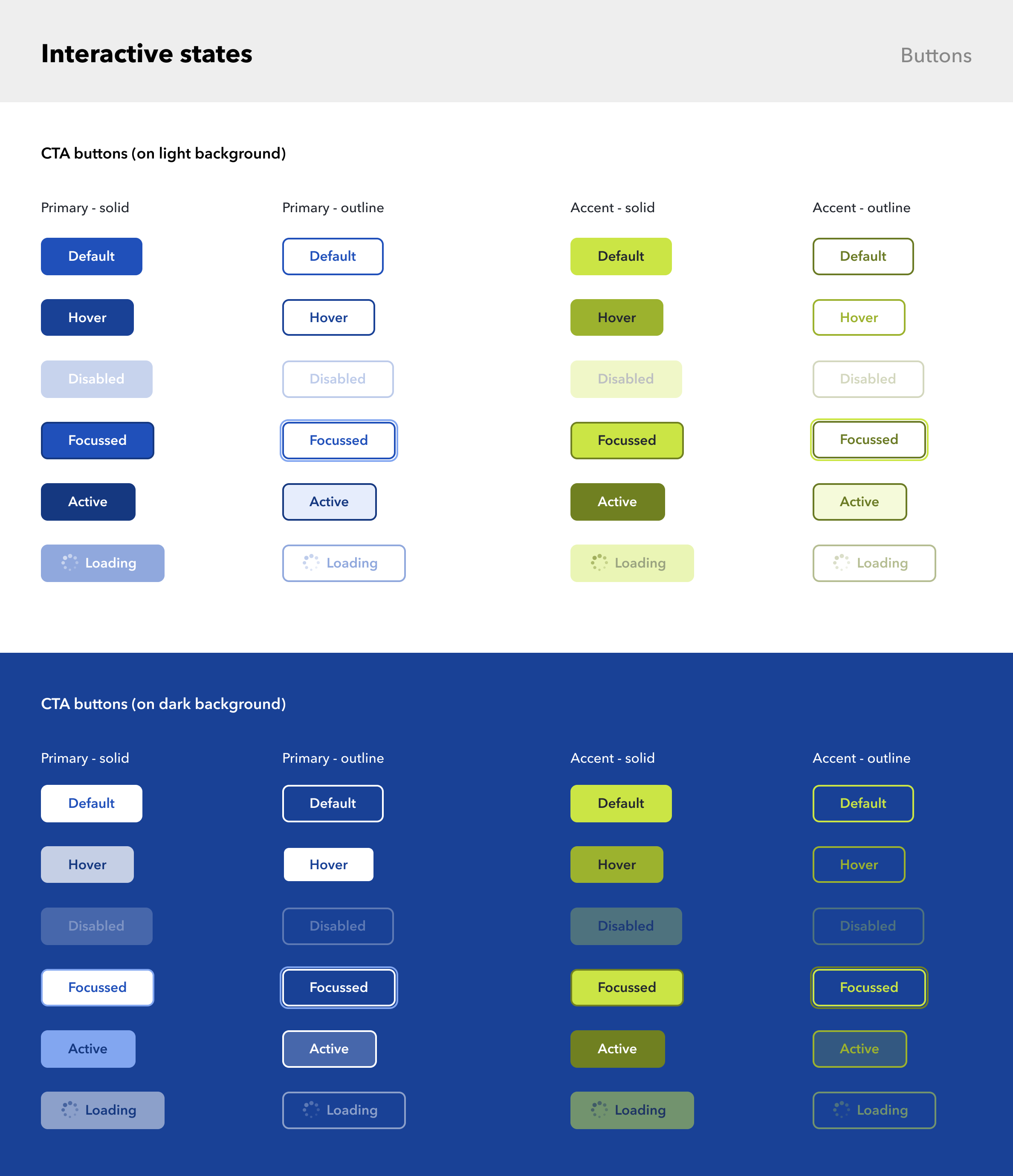
In terms of icon button sizing within my UI, Human Interface Guidelines mandate that on a touchscreen, buttons need a minimum hit target of 44x44px to accommodate a fingertip. I therefore took this into consideration when sizing my icon and button areas, and ensured all instances met this minimum standard. See below my banking app's different CTA states: default, hover, disabled, focussed, active, and loading, in both solid and outline styles for use on light and dark coloured backgrounds.
Get in touch
Would you like to work together or simply chat about a project? Don't hesitate to contact me.