Case Study
'Seasons'
Flower Poster Designs
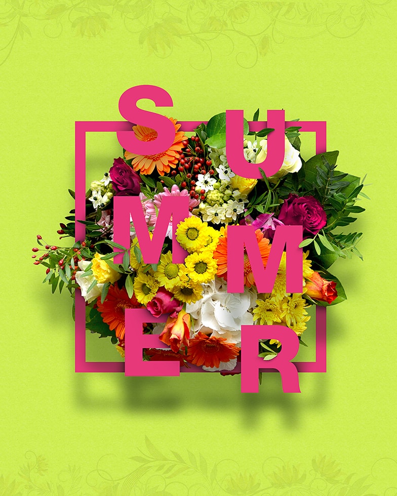
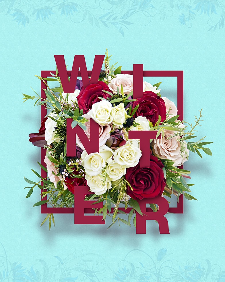
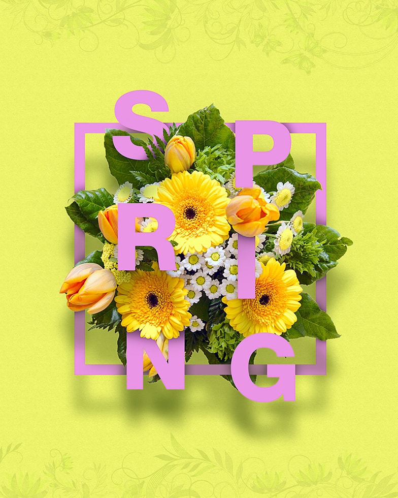
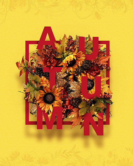
This series of illustrative poster designs was undertaken to challenge and develop my graphic design skills, in terms of harmoniously combining typography with realistic photography. The project also helped me develop my understanding of colour, visual balance, shadow and depth. Colours were carefully chosen to compliment, contrast and visually represent the feeling of the season being portrayed.
Scope
Graphic Design, Illustration, Typography, Photomanipulation
Year
2017
Softwares Used



Get in touch
Would you like to work together or simply chat about a project? Don't hesitate to contact me.
