Case Study
Newsletter Email Design
Thought Fashion
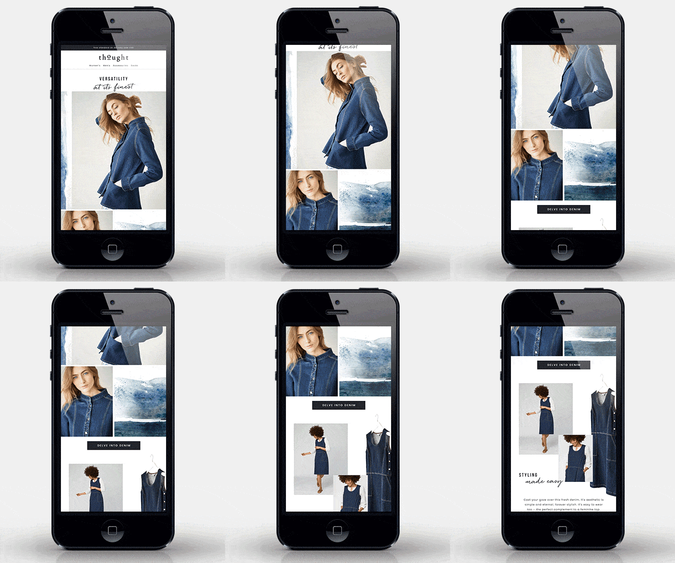
As a Graphic Designer for Thought Fashion, I was responsible for creating designs for their weekly newsletter emails, which were broadcast to a mailing list of 25K+ subscribed customers. To ensure visual balance and clear storytelling, I used my knowledge of color theory, white space and grid layouts to guide the customer's eye through the email. Bold visuals, engaging GIFs, and creative illustrations, alongside clean product grids, all contribute to making the product feel inspiring for the customer, thus resulting in increased click-through rates. This drives traffic to the website, ultimately increasing conversions.
See below a handful of email designs that I put together.
Scope
Graphic Design, UI/UX design, E-commerce
Year
2018-2019
Softwares Used


Get in touch
Would you like to work together or simply chat about a project? Don't hesitate to contact me.


